RugSpace
Outcome
Problem
Metrics
Research
Personas
Scope
IA
User Flow
Decisions
Iteration
Edge Cases
A11y
Reflection
RugSpace
Outcome
Problem
Metrics
Research
Personas
Scope
IA
User Flow
Decisions
Iteration
Edge Cases
A11y
Reflection
RugSpace
Outcome
Problem
Metrics
Research
Personas
Scope
IA
User Flow
Decisions
Iteration
Edge Cases
A11y
Reflection
RugSpace
Outcome
Problem
Metrics
Research
Personas
Scope
IA
User Flow
Decisions
Iteration
Edge Cases
A11y
Reflection
RugSpace
Outcome
Problem
Metrics
Research
Personas
Scope
IA
User Flow
Decisions
Iteration
Edge Cases
A11y
Reflection
Project summary
Challenge
Rug buyers can't judge size, color, or fit from a product photo — leading to hesitation and costly returns.
Solution
An AI visualization studio that places any rug into the buyer's own room photo, true to scale and light, with side-by-side comparison.
Role
Solo UX designer — problem framing, research synthesis, IA, flow, hi-fi UI, and iteration.
Outcome
A 15-screen hi-fi prototype with a reasoned decision trail, ready for usability testing.
Project outcome
15
Screens designed end-to-end, landing through order confirmation
3
Usability issues found in review and resolved before final delivery
4
Core assumptions defined and made explicit, ready for validation
1
Clear market gap: no competitor pairs room-accurate visualization with rug-specific sizing and comparison
RugSpace is a self-directed, conceptual case study — not a shipped product. What it delivers is a validated problem framing, a fully reasoned decision trail, and a scoped hi-fi prototype ready for usability testing.
Project summary
Challenge
Before designing a solution, it's worth being honest about how you'd know if it worked.
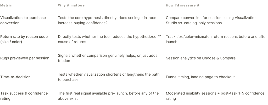
Success metrics
How I'd know RugSpace is actually working
This is a conceptual project, so none of the numbers below are measured results — they're the specific, falsifiable signals I'd track if this shipped, defined up front so success isn't decided after the fact.
Beyond a feature comparison, I looked specifically at where each competitor's visualization experience breaks down in practice.
Competitive & UX audit
The opening: nobody combines room-accurate visualization with rug-specific sizing and easy side-by-side comparison in one browser-based flow.

Assumptions I designed against
Key insights
The synthesis of everything above — what actually drove the design direction.
Size and color are the two variables a photo can't verify — and they're exactly the two things every competitor audited leaves unsolved, together.
Comparison is a normal step in the decision, not an edge case — the flow needed to design for it directly, not treat it as a power-user feature.
Existing tools solve visualization or cataloging — never both, with sizing, in one place. That gap is the actual product opportunity, not a new visualization technology.
Material knowledge outperforms generic UX pattern-matching here — the highest-leverage decisions (lighting toggle, size logic, rationale copy) came from the rug trade, not from e-commerce conventions.
How might we...
...visualize rugs accurately in a real space?
...reduce uncertainty around size and color?
...let people compare options effortlessly?
Takeaway → the research pointed to real people with different stakes in the same problem — a buyer deciding for herself, and a professional deciding on behalf of clients — which is why the next step was building two personas, not one.
Two working hypotheses about who this serves
Provisional personas
Built from domain expertise and secondary research
These are working hypotheses, not confirmed user types — built from the research above rather than new interviews. Aditi Mehra is a marketing manager actively hunting for a rug for her new place. Rohan Kapoor is an interior designer who needs fast client sign-off to keep a project moving.
Aditi Mehra
Marketing Manager · Bangalore · 31
"I just want to be sure it'll look right in my space before I commit."
Hypothesized pain point
Can't judge size or true color from a photo alone; hesitates on high-cost purchases as a result.
How it shaped the design
Room upload, AI-matched lighting preview, contextual size guidance.

Rohan Kapoor
Interior Designer · Gurugram · 38
"If clients could see it in their space first, approvals would be so much faster."
Hypothesized pain point
Slow client approvals when options can't be pictured remotely.
How it shaped the design
Compare view doubles as a shareable, presentable artifact.

Takeaway → Aditi and Rohan need the same core tool for different reasons — which is why scope had to prioritize the shared flow over building separate features for each.
Trade-off · Photo-based AI vs. live AR camera preview
Chosen: a single uploaded photo, processed by AI to detect floor, scale, and light.
Alternative considered: a live, walk-around AR camera view, like IKEA Place.
AR gives more spatial fidelity, but it demands an AR-capable device and pulls the buyer out of a normal browsing session into a separate camera mode — exactly the friction the competitive audit flagged in IKEA Place. A photo upload works on any device already open to the site, and answers the same core assumption (does visualization build confidence) without that cost. I'd revisit AR only after the photo-based flow proves the hypothesis.
With scope fixed, the next question is where each piece lives relative to the others.
Information architecture
Structured around one dominant goal
Research pointed to a single dominant goal — seeing the rug in your own space before buying — so the IA centers the Visualization Studio as the core, with browsing, comparing, and checkout hanging off it rather than competing with it for priority.

Takeaway → the IA fixes where each piece lives; it doesn't yet say what a person is thinking at each point in that structure — that's the gap the user flow below closes.
This is the part that actually matters: not what each screen looks like, but why it exists in this exact form.
Design decisions
Every key screen, argued from a real constraint
Once the flow was validated at low fidelity, each screen below was designed against a specific challenge.

Upload Room
Challenge — the AI's entire output depends on one variable most people get wrong on the first try: the room photo.
Decision — pair the upload area with a permanent tips panel addressing the three real failure modes, before any error occurs.
Reasoning — a recovery screen fixes a bad photo after the fact; teaching the right photo up front prevents the failure and costs the person less time than a retry loop.
Outcome — framing, lighting, and clutter — the three tips shown — map directly onto the three reasons detection can fail below, so the two screens reinforce each other.

Choose Your Rug
Challenge — this step has to support browsing, filtering, and deciding at once, without becoming three separate screens.
Decision — one filterable grid with a persistent selected-rug detail panel and room-based size recommendation, instead of a modal or separate detail page.
Reasoning — sending someone to a new page for rug details breaks the spatial context just built during upload; keeping it inline keeps the room and the decision in the same view.
Trade-off — a separate detail page would have given more room for expanded specs and cross-sell; I chose the inline panel because losing spatial context costs more here than losing extra copy space.
Outcome — size recommendations are computed against the actual detected room dimensions, directly answering the size uncertainty named in the problem statement.
Compare Rugs
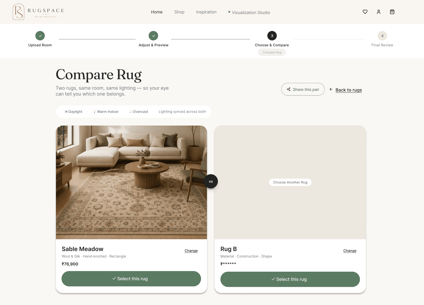
Challenge — comparing two rugs from memory across two separate product pages is how most people currently "compare" online, and it's unreliable.
Decision — a dedicated Compare screen renders both candidates into the same room photo, side by side, under the same light.
Reasoning — domain expertise mattered most here: rug decisions are relative, not absolute — people rarely choose in isolation, they choose "this one, not that one."
Outcome — comparison becomes the actual decision-making moment in the flow, answering assumption 03 from the research directly.
Final Review
Challenge — a photorealistic render alone doesn't tell someone whether a rug is objectively a good fit — it just looks nice.
Decision — pair the render with a plain-language "why this rug works" panel and a lighting-condition toggle (daylight / warm / overcast).
Reasoning — the single most common surprise in a real rug delivery is color shift under different light — surfacing that before checkout is the entire point of the product.
Trade-off — rendering three lighting conditions instead of one costs extra AI processing time per rug; I judged that cost worth paying, since color-under-light was the single most common regret I heard from customers in person — a one-condition render would have shipped faster but left the actual failure point unaddressed.
Outcome — converts a visual preview into an evidenced decision, using the same three variables — size, color, texture — set up in the opening problem statement.

Checkout
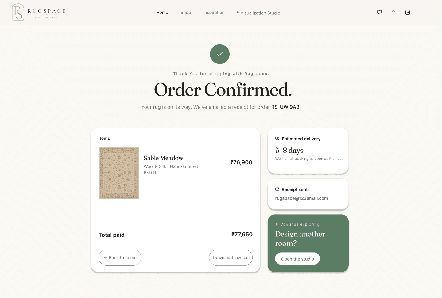
Challenge — after four steps of consideration, checkout needs to feel like a formality, not a fresh decision.
Decision — the order summary — including the actual rendered rug image, not just its name — stays visible through contact, shipping, and payment.
Reasoning — losing sight of what you're buying mid-checkout reintroduces the exact doubt the whole flow was designed to remove.
Outcome — the visualization follows the person all the way to payment, instead of being left behind after Final Review.
Order Confirmed
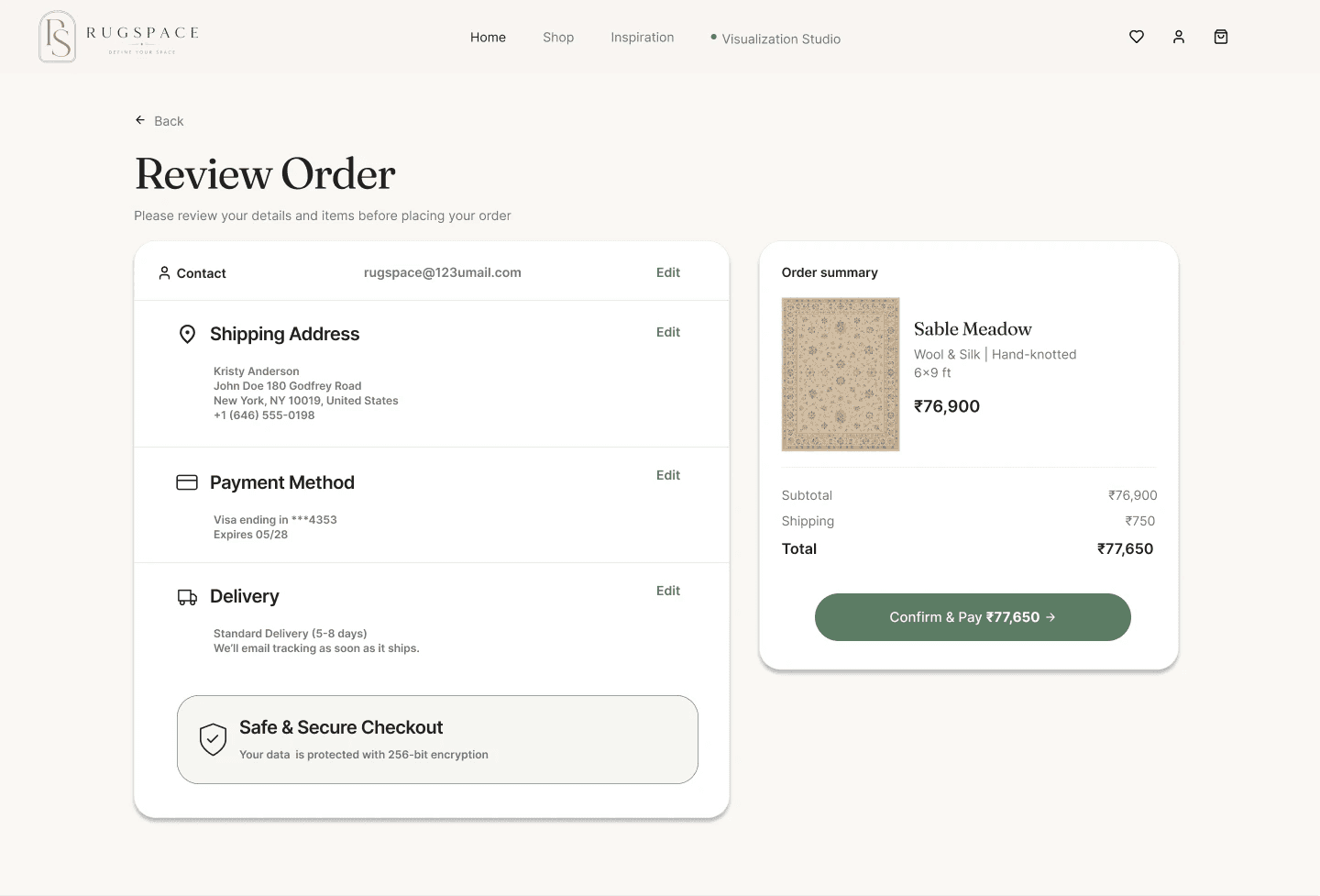
Challenge — confirmation screens are usually the most neglected part of a flow, even though they're the last impression a person takes away.
Decision — pair confirmation with a delivery estimate and a direct "design another room" prompt.
Reasoning — since visualization is the differentiator, confirmation is the cheapest possible moment to invite a second use of the tool.
Outcome — closes the loop on this purchase while opening the door to the next one, feeding back into the IA loop shown earlier.
Digital low-fidelity wireframes

Homepage

Upload Room

Adjust & Preview

Choose Rug

Compare Rug

Final Review

Checkout & Payment
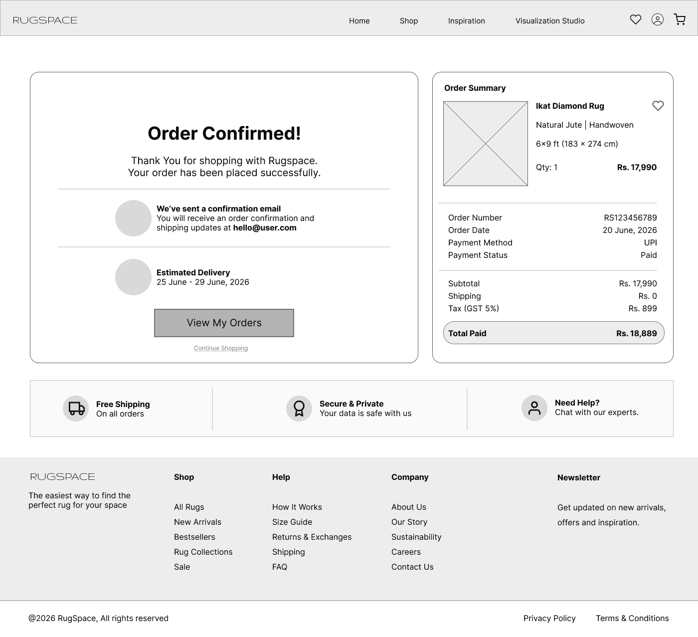
Order Confirmation
Static screens only tell part of it — the transitions and timing matter too.
See it in motion
Prototype walkthrough
A short screen recording narrating the core flow — upload, visualize, compare, checkout — alongside the interactive prototype link above.
A flow only looks finished if you never look at what happens when it fails.
Edge cases & error states
What's solid, and what's honestly still open
Closing the highest-priority gap
Upload Room — designed error & empty states
Of the gaps above, this is the one I chose to actually design — not because it's the easiest, but because Upload Room is the funnel's entry point: if this step fails silently, nothing downstream matters.


Takeaway → handling failure gracefully only matters if the interface doesn't exclude someone before it even gets the chance to fail — which is what accessibility below actually checks.


Design system
Visual System & Components
Every screen in the prototype draws from one shared set of components rather than one-off layers, so a change made in one place holds everywhere.
Fraunces for headlines against Inter for UI text — an editorial, crafted warmth that echoes handmade rugs, paired with the legibility precision that prices, forms, and controls need. The palette stays warm and muted rather than a generic e-commerce blue, so the UI never competes with rug color and texture, which is exactly what customers are trying to judge accurately.
Buttons
Start Visualizing
Primary — default
✓ Added
Primary — confirmed
Explore Rugs
Secondary — outline
Save to Favorites
Tertiary — text link
System status
Progress
AI process checklist
Rendering final preview
✓Room perspective detected
Loading & upload
✓ File Uploaded

#22221F
#3F5443
#6E8471
#AAB6A4
#D6D3CE
#E7EDE6
#FDF0E3
#F5F3EE
Aa
Inter
Sans — body & UI
Payment
▭
•••• 4353
05/28
✓
Selection
☀ Daylight
★ Warm Indoor
Modern
Traditional
Transitional
Aa
Fraunces
Display serif — headings

RugSpace — a self-directed case study by Charu
The problem
Three uncertainties compound at the exact moment someone decides to buy.
Size
Is this the right footprint for the room — not the abstract dimensions on a product page, but how it actually sits under the furniture.
Color
How will the dye actually read under the buyer's own lighting — not a studio softbox designed to flatter every rug equally.
Confidence
Is there any way to know before delivery — or only after unrolling an expensive, awkward-to-return object at home.
Oversized, heavy home goods like rugs and furniture are consistently among the hardest categories to sell with confidence online, precisely because scale and true color are the two things a flat photo can't reliably convey. Unlike a t-shirt, a wrong-size rug isn't a quick, cheap return — it's a shipping and restocking problem for the business, and a frustrating dead end for the buyer.
Before I moved into UX, I worked as an Assistant Manager at a handmade rug company in Jaipur. I watched the same hesitation play out across dozens of customers: they loved a rug in the photo, but couldn't tell if it would actually work in their space. That first-hand pattern is where RugSpace's problem framing came from — everything that follows was built to pressure-test that observation, not to assume it was automatically true for every buyer.
Size
Is this the right footprint for the room — not the abstract dimensions on a product page, but how it actually sits under the furniture.
Color
How will the dye actually read under the buyer's own lighting — not a studio softbox designed to flatter every rug equally.
Confidence
Is there any way to know before delivery — or only after unrolling an expensive, awkward-to-return object at home.
"I didn't start with a persona template —
I started on the sales floor."
Research & insights
Grounding an experience-based hunch in outside evidence
This case study didn't start with a hunch — it started with a pattern I lived through repeatedly at my last company: clients rejecting finished rugs over how they looked once they arrived, irregular rugs ending up flipped or rotated in someone's home due to miscommunication down the production chain, and meetings that stretched for hours just trying to get ahead of problems before a rug ever left the loom. Those weren't isolated incidents — they were recurring enough that I started treating them as a real problem worth solving. What this project's scope didn't include was commissioning new interviews to re-validate that problem from scratch. So here's exactly what I did instead: secondary research to see how the broader industry handles this, a structured competitive UX audit of existing tools, and an explicit set of open questions — flagged clearly — that a first round of usability testing would need to answer.
Secondary research
Public customer reviews & discussion across major rug and home-goods retailers
Reading through publicly available reviews on rug and furniture retail sites surfaces a recurring, easy-to-verify pattern: complaints clustering around "smaller than expected," "color looked different in person," and "wish I could've seen it in my room first."
· Scale/size mismatch is a frequently cited return reason in this category
· Color-under-lighting complaints appear across multiple retailers, not one outlier
· Shoppers describe comparing tabs/options manually before deciding
Domain expertise
Direct industry experience, Jaipur rug manufacturing
Material knowledge that a review can't surface: pile height changes how a pattern reads at a distance, wool and silk-blend absorb warm light differently, and scale mistakes are the single most common regret sellers hear in person. That 'it looked different' moment I mentioned earlier was, almost always, about light — not the rug.
· Informed which variables (size, light, texture) actually deserve UI real estate
· Informed the "why this rug works" reasoning shown in Final Review
· Directly shaped the lighting-condition toggle in Final Review — a feature no competitor audited below offers
Product strategy & scope
Five ideas surfaced. Two made the cut.
Given a solo, 4–6 week timeline, I scoped to the two directions that most directly addressed the assumptions above, and deliberately deferred the rest — with reasons, not just a backlog.
Built into v1
AI Room Visualization
Directly answers assumption 01 — visualization increases confidence.
Side-by-Side Comparison
Directly answers assumption 03 — people compare before deciding.
Deferred, and why
AR Preview
High engineering cost for a solo project; photo-based AI detection tests the same core hypothesis faster.
AI Style Recommendations
Recommendation quality depends on data this project doesn't have yet — premature before the core flow is validated.
Multi-rug Room Layout Planner
A real need for interior designers like Rohan, but it's a different problem (spatial planning) from the one this project scoped — color/size confidence for a single rug.
Structure explains where things live. Flow explains what the person is actually thinking at each step.
User flow
The complete journey, landing page to order confirmation
Each stage is written from the person's point of view — the question in their head right before they act.
Landing
"Is this worth my time?"
→
Upload Room
"Will my photo actually work?"
→
Adjust & Preview
"Did it read my room correctly?"
→
Choose & Compare
"Which one, not just 'is this nice'?"
Final Review
"Am I sure, under real light?"
→
Checkout
"Don't make me re-decide now."
→
Order Confirmed
"When does it arrive, and can I do this again?"
Takeaway → the sharpest question at each stage — "will my photo work," "which one, not just is this nice" — is what each screen in Design Decisions below had to answer directly, not just accommodate.
None of the decisions above started at high fidelity.
Process
Paper first, then pixels

Homepage

Upload Room

Choose rug

Compare & preview

Final review
Early paper exploration of the six core flow screens, before anything moved into Figma.
A first pass at high fidelity is never the shipped version — here's what changed and why.
Iteration
What changed between versions, and why
A structured review pass surfaced three concrete issues in the first hi-fi build.
V1
Progress stepper showed 4 steps;
the real flow spanned 8+ screens.
→
V2
Kept 4 stages, added a sub-label showing
which of step 3's five screens you're on.
Why it changed: shoppers anchor heavily on progress indicators — silently under-reporting how much is left erodes trust exactly when someone is deciding whether to keep going.
V1
Header/nav duplicated as raw
layers across all 11 frames.
Converted into one master component, l
inked as an instance everywhere.
Why it changed: any future nav edit meant manually touching 11 separate frames — a maintainability risk and a signal of file hygiene to anyone opening the source file.
→
V2
V1
Checkout showed a saved card above empty entry
fields, simultaneously, with no clear relationship.
→
V2
Two explicit states: a locked saved-card summary,
or a clean new-card form — never both.
Why it changed: payment UI has zero tolerance for ambiguity — a person couldn't tell if editing those fields overwrote their saved card, which is exactly the doubt that causes checkout abandonment.
Takeaway → every fix above came from a screen that looked correct until it was checked against a specific person's confusion — which is exactly the habit the edge-case work below extends to states that don't even have a happy path yet.
Accessibility
Designed with intention, audited honestly
These reflect specific interaction decisions made during design — not a formal WCAG audit or assistive-technology test pass.
Touch targets
Primary CTAs ("Start Visualizing," "Add to Cart," "Proceed to Payment") and the rug cards in Choose & Compare are sized and padded past the 44×44px minimum, with enough gutter between adjacent cards to avoid mis-taps on a dense catalog grid.
Typography
Body copy set at 16px minimum with 1.5+ line height; the Fraunces display serif is reserved for headlines and short labels only — never for dense paragraph text, where a serif at that weight would slow reading.
Form design
Checkout's contact, shipping, and payment fields use visible, persistent labels above each input, not placeholder-only text — so the field's purpose doesn't disappear the moment someone starts typing their address or card number.
Rugs are one of the highest-uncertainty purchases in home goods e-commerce — wrong size, wrong color under real light, no way to know until it's already unrolled on the floor. RugSpace lets someone preview the exact rug in their own room, true to scale and light, before they spend a rupee.
The result: a shopper decides with the same confidence they'd have standing in a showroom — without leaving their living room.
Role
Solo — UX Design & Research
Duration
4–6 weeks, self-directed
Product
Responsive web app
Stage
Hi-fi prototype, 15 screens
Tools
Figma, Claude
UX Case Study
Rugs are one of the highest-uncertainty purchases in home goods e-commerce — wrong size, wrong color under real light, no way to know until it's already unrolled on the floor. RugSpace lets someone preview the exact rug in their own room, true to scale and light, before they spend a rupee.
RugSpace
